A Place for All Conservatives to Speak Their Mind.
Friday, April 10, 2026
Politico Tortures FEMA Data To Pretend Trump Is Denying Disaster Relief In Blue States: Politico Reduced 2,500 Disaster Declarations to 45 Data Points, Slapped a Partisan Label On Them, and Called It Journalism
Politico Tortures FEMA Data To Pretend Trump Is Denying Disaster Relief In Blue States:
Politico reduced 2,500 disaster declarations to 45 data points, slapped a partisan label on them, and called it journalism.
There is something really fun about data detective work.
Sometimes this work is done quickly. Someone will show a chart, point
to the source data, and I’ll grab the data, and it turns out that the
chart is just a simple graphical representation of the source data. For
people who care about the truth, this is the ideal scenario, but it is
also boring. I want some really outrageous narrative driven by a chart,
but it’s hard to figure out where the data came from. That’s where the
real fun is.
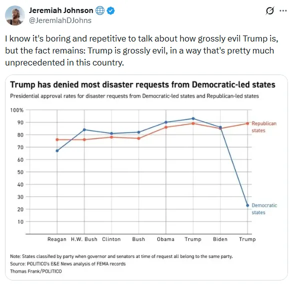
I got that this weekend in this chart, which came to my attention through Jeremiah Johnson.
The chart tells the story of a vindictive, cartoonishly evil president
who is making the victims of disasters suffer because they live in the
wrong state.
The president has approved just 23 percent of blue state requests for disaster aid, compared to 89 percent for red states.
Charts like this very rarely come from nowhere. Most journalists at
least still have enough integrity to not completely make up data. The
nature of this particular accusation is extraordinary and extreme.
Denying emergency relief to American citizens based on their politics
would be an act of wanton cruelty. But that severity cuts both ways. To
falsely accuse the Trump administration of such an act would be a
cynical and cruel thing to do. If someone were to cherry-pick data or
manipulate their data sets in order to cause their fellow citizens to
believe a falsehood this severe would be the act of a sociopath.
I went to find out if this is really what the data said and how the data was manipulated in order to get to the chart above.
Finding the core data was pretty easy. FEMA hosts a comprehensive set
of data on the OpenFEMA website. The two data sets that we care about
are Declaration Denials and FEMA Web Disaster Declarations.
Let’s compare Trump’s second term to Joe Biden’s term in office. I’m
doing this because that is a comparison already being made in the chart
above, but also because that trims our data set down so we can talk
about it in a little more detail.
We’ll start with some raw stats from this data. During Joe Biden’s
term, FEMA denied 56 aid requests and approved 512, a 9.9 percent
rejection rate. So far during Trump’s second term, FEMA has denied 24
aid requests and approved 141, a 14.5 percent rejection rate.
If we’re trying to tell a “Red vs. Blue” partisan story, it’s going
to matter a lot how we define Red and Blue. It’s pretty typical to use
the presidential election results as a proxy for redness and blueness.
But, then again, the chart says “Democrat-led” so maybe we should use
the party of the state governor as our indicator.
Politico rejected both those definitions and decided that
“[party]-led” means that a state has a governor and two senators from
the same party.
This definition should raise eyebrows because it immediately kicks 10
states out of our data set (11 if we count Virginia when they had a
Republican governor last year). North Carolina and Kentucky both have
Democratic governors and Republican Senators and were both subject to
recent natural disasters but they will not show up on this chart at all.
It also means that, if the narrative of this chart is true, Trump is
punishing two states that voted for him (Arizona and Michigan) because
they are “Democrat-led”. That seems like an odd thing to do.
I want to show how this framing changes our results. Let’s look at
Biden-era FEMA denial rate by party, but change our definition for “red”
and “blue” to reflect the election results (which states voted for
Biden in 2020), the party of the governor, and using the Politico
“governor plus both senators” metric. --->READ MORE HERE
If you like what you see, please "Like" and/or Follow us on FACEBOOK here, GETTR here, and TWITTER here.


No comments:
Post a Comment